


Derthona Basket's new brand identity. Mayor Chiodi and President Picchi unanimously agreed: "A visual system that strengthens the bond between the club and the city."
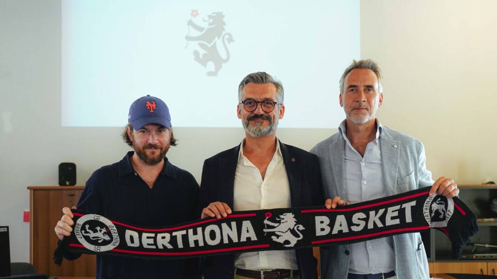
This morning, Monday 7 September, the press conference to launch the new Derthona Basket 𝐁𝐫𝐚𝐧𝐝 𝐈𝐝𝐞𝐧𝐭𝐢𝐭𝐲 took place in the Town Hall of Tortona. For the Mayor of Tortona 𝐅𝐞𝐝𝐞𝐫𝐢𝐜𝐨 𝐂𝐡𝐢𝐨𝐝𝐢 and the President 𝐌𝐚𝐫𝐜𝐨 𝐏𝐢𝐜𝐜𝐡𝐢 it was the opportunity to underline the close and fruitful bond that unites the Club to the community and its territory: a natural symbiosis further strengthened by the 𝐧𝐮𝐨𝐯𝐨 𝐬𝐢𝐬𝐭𝐞𝐦𝐚 𝐯𝐢𝐬𝐢𝐯𝐨 , created by the brand & graphic designer, 𝐀𝐧𝐝𝐫𝐞𝐚 𝐏𝐞𝐫𝐚𝐭𝐨 (pictured next to Chiodi and Picchi), together with 𝐃𝐚𝐯𝐢𝐝𝐞 𝐁𝐞𝐧𝐚𝐭𝐭𝐢 , among the authors of the typeface on behalf of ESC Design Studio, both protagonists of the press conference in the story of the long study that characterized their work, for which they also took inspiration from the archive of Roberto Gabatelli , historical “narrator” of the exploits of Derthona who also spoke during the event.
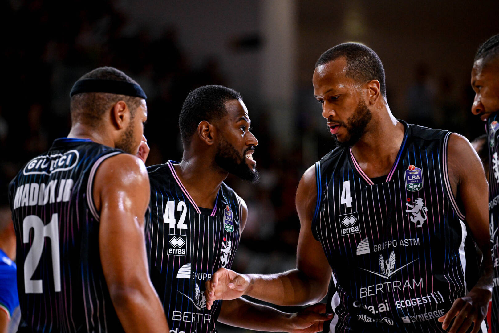
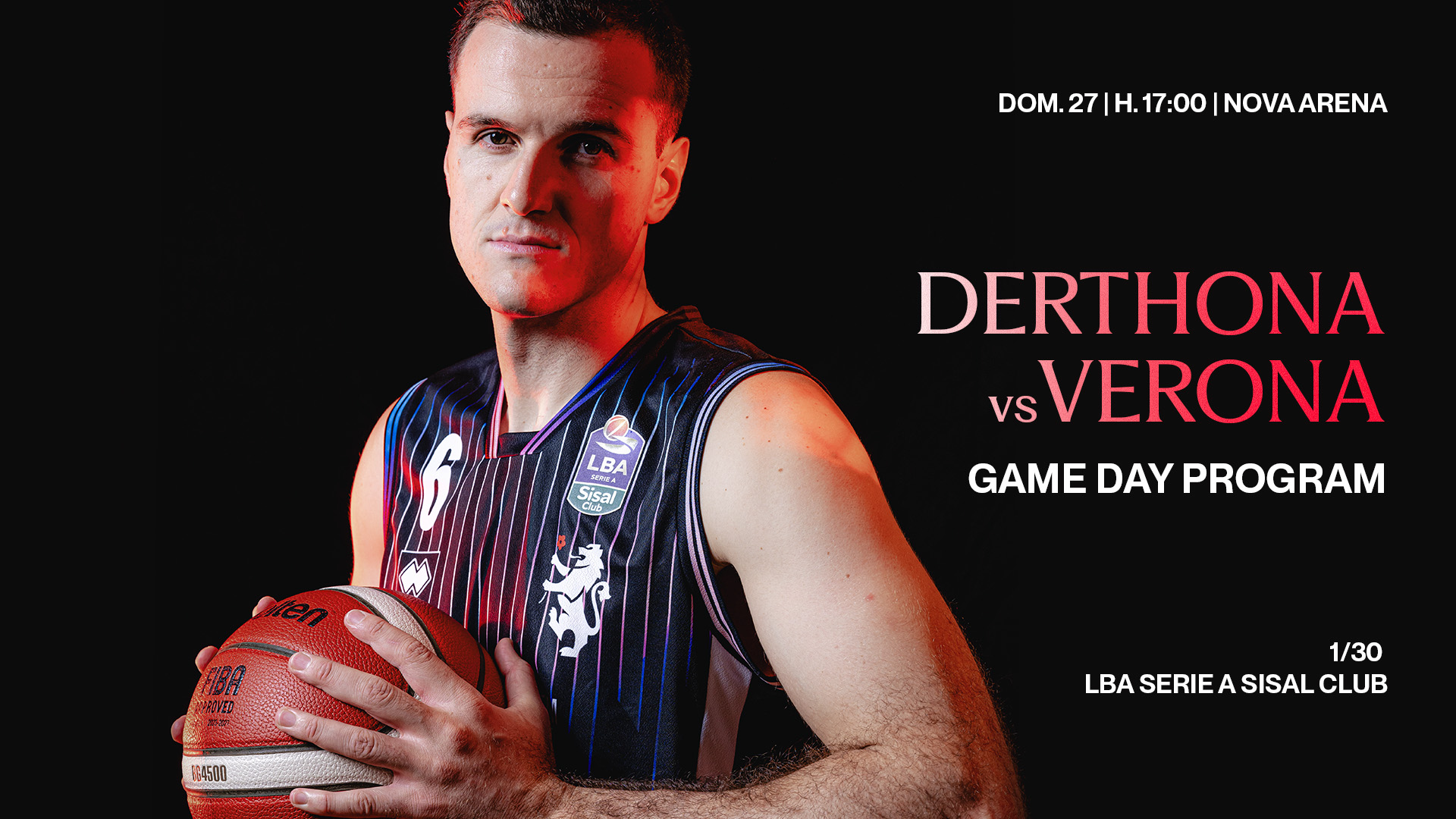
“Rooted in history, ready for the future.” The elements of the new brand identity enhance the symbols and colors representing the City of Tortona, evoking the history of Derthona as a heritage that spans generations, evolves over time, and today finds a foundation on which to continue building a new form of expression and an identity capable of accompanying its future.
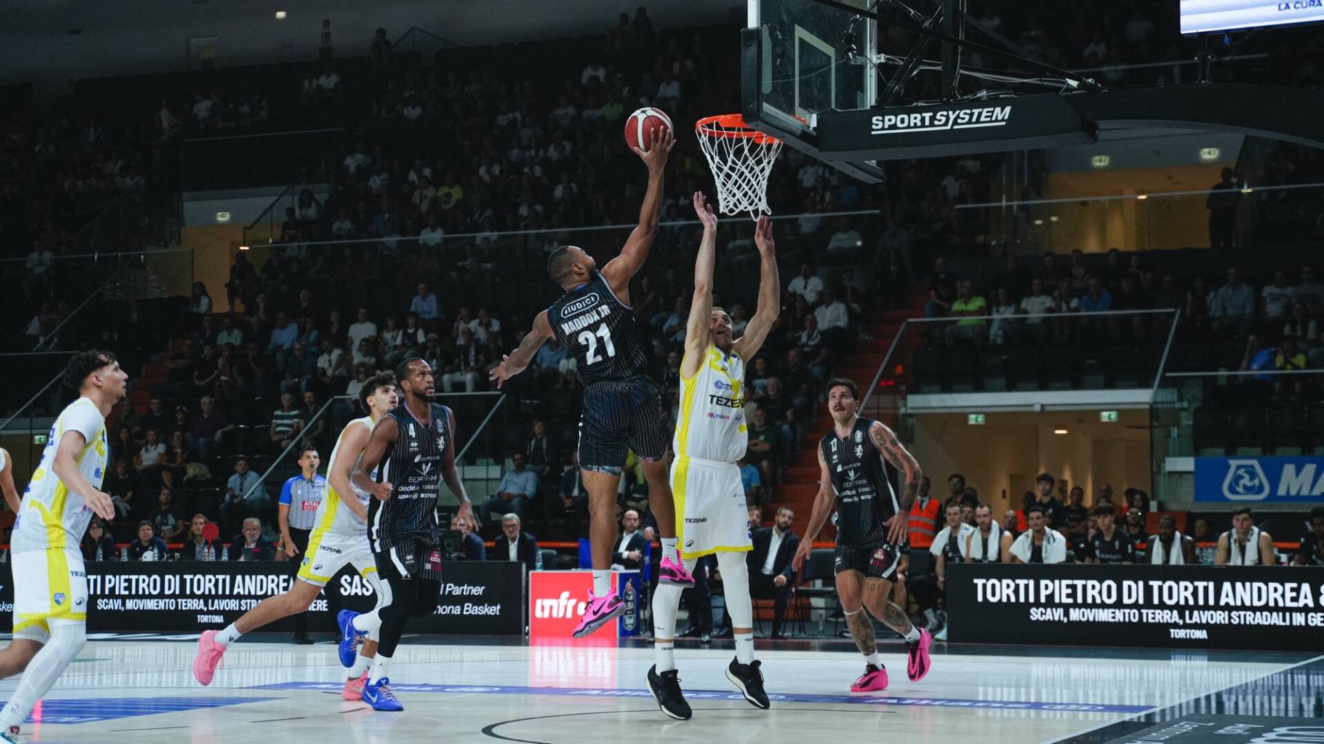
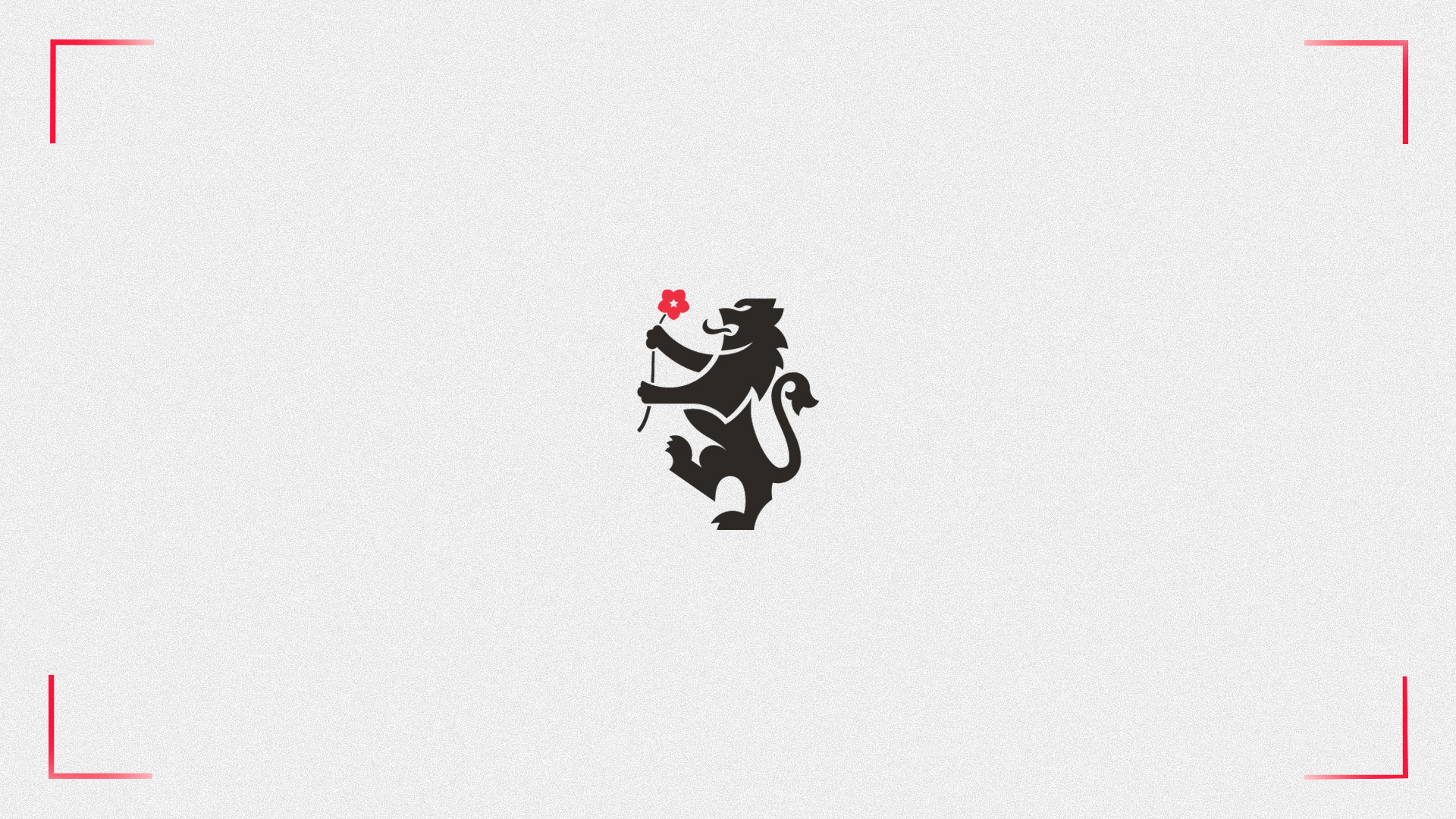
" I'm particularly pleased to participate in the presentation of this new identity because, looking at it, what stands out is that there's so much of Tortona in it ," said Mayor Chiodi . "There's the lion, there's the rose, there are the city's colors, there are references to our territory, everything that characterizes it. And I believe it's right this way, because Derthona Basket is a club founded in Tortona in 1955 and grew alongside our city, evolving over its 70-year history. Derthona Basket is an integral part of the city of Tortona, and there are clear elements that testify to this, such as the construction of the Cittadella dello Sport with the Nova Arena, which allowed the team to finally return home, thousands of people flock to the Nova Arena to watch the game, and fans of Italian and international teams flock to Tortona." Derthona has become a national and European reality, and when it has to choose how to visually present itself to an ever-growing audience, it doesn't look elsewhere; to find its identity, it returns to Tortona: in my opinion, this is the most beautiful meaning of this new image, not just a graphic design but an act of belonging.
"Climbing the steps of the Town Hall today, a moment from nine years ago came to mind," President Picchi began . " It was the summer of 2017 when, in this very room, we first presented a partnership with a new sponsor, Bertram. Honestly, I never imagined, nine years later, I'd be here telling a story that, starting as a sponsorship with a company represented by the Gavio family, has achieved so much on the field, but especially off it. Anyone who passes by the highway today and looks toward the Cittadella dello Sport, toward the sports hall, understands what it's all about. I think a club like ours must be able to look to the future, while always remembering its roots. And when I first saw, more or less secretly, the drafts of the work we're presenting today, I had that positive feeling: we're a club that wants to look forward, but remembering where we came from, what our roots are, and above all, the roots of our territory."
I believe we need to send a message to our fans right now, because we're in a unique moment in history. Basketball, both in Italy and internationally, is experiencing enormous changes, unimaginable just a few years ago. We're seeing foreign ownership and investment funds approaching Italian basketball, and clubs moving from one city to another. I've always been very proud of my sense of belonging to my city, my region, and especially to the basketball club where I was born and raised. Today, this sense of pride, if I take off my president's hat and put on a fan's jersey, is even more pronounced. I certainly don't know what the immediate future holds on the court, how many games we'll be able to win, what the European adventure will be like, how many rounds we'll advance to, or whether we'll reach the finals. But what I can certainly guarantee is that Derthona is and will remain Tortona's team. It's the team of this region, and it's represented by a family that has done so much for this region, and not just in basketball.
"So, thank you for the work done on the brand identity, to the entire communications team and everyone who works at the club. It's truly been a top-notch effort. It's a job we'll be talking about over time, but I believe it's already a testament to Derthona Basket's desire to grow and develop alongside its fans, its residents, and its community."
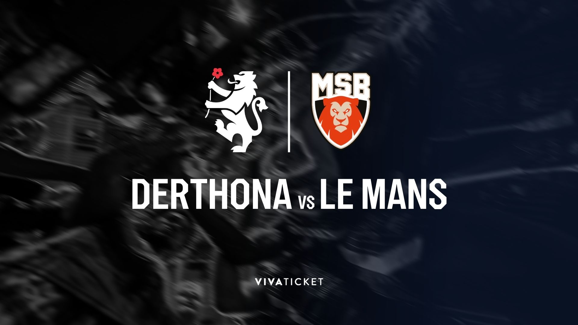
"Rebranding doesn't mean inventing a logo from scratch, but rediscovering what already exists and giving it a new language ," says Andrea Perato . " We started from the history of Derthona and the city of Tortona, from its roots and its symbols, the lion and the rose, to bring them into a European, contemporary, and recognizable dimension. We didn't change the team's identity: we made it stand out, building a system around it capable of narrating it in different ways and contexts."
The launch video for the new Brand Identity, previewed by Sky Sport during the post-match press conference after the Italy-Serbia match, valid for the European qualifiers for the 2027 World Cup: