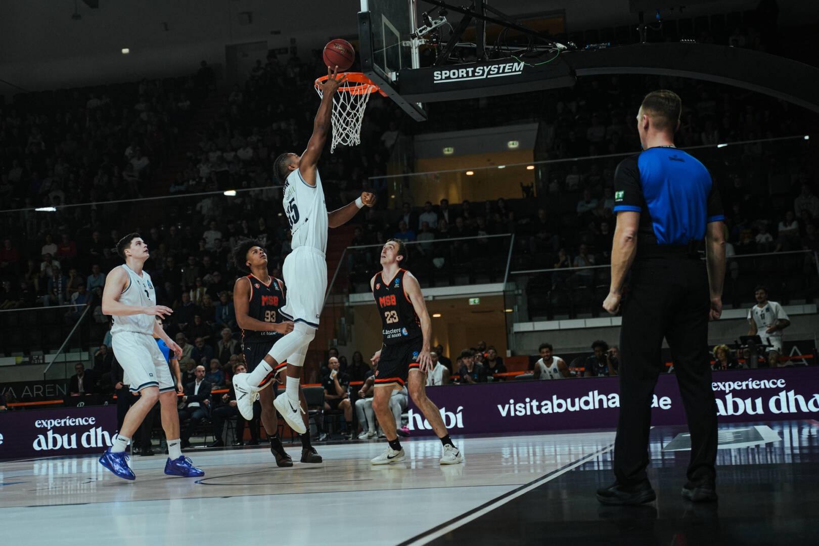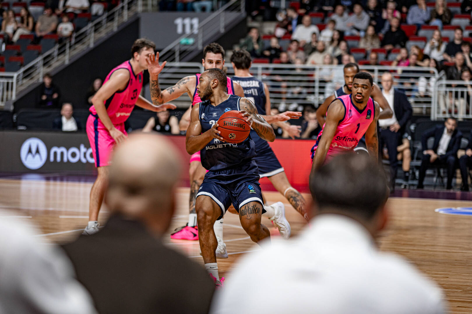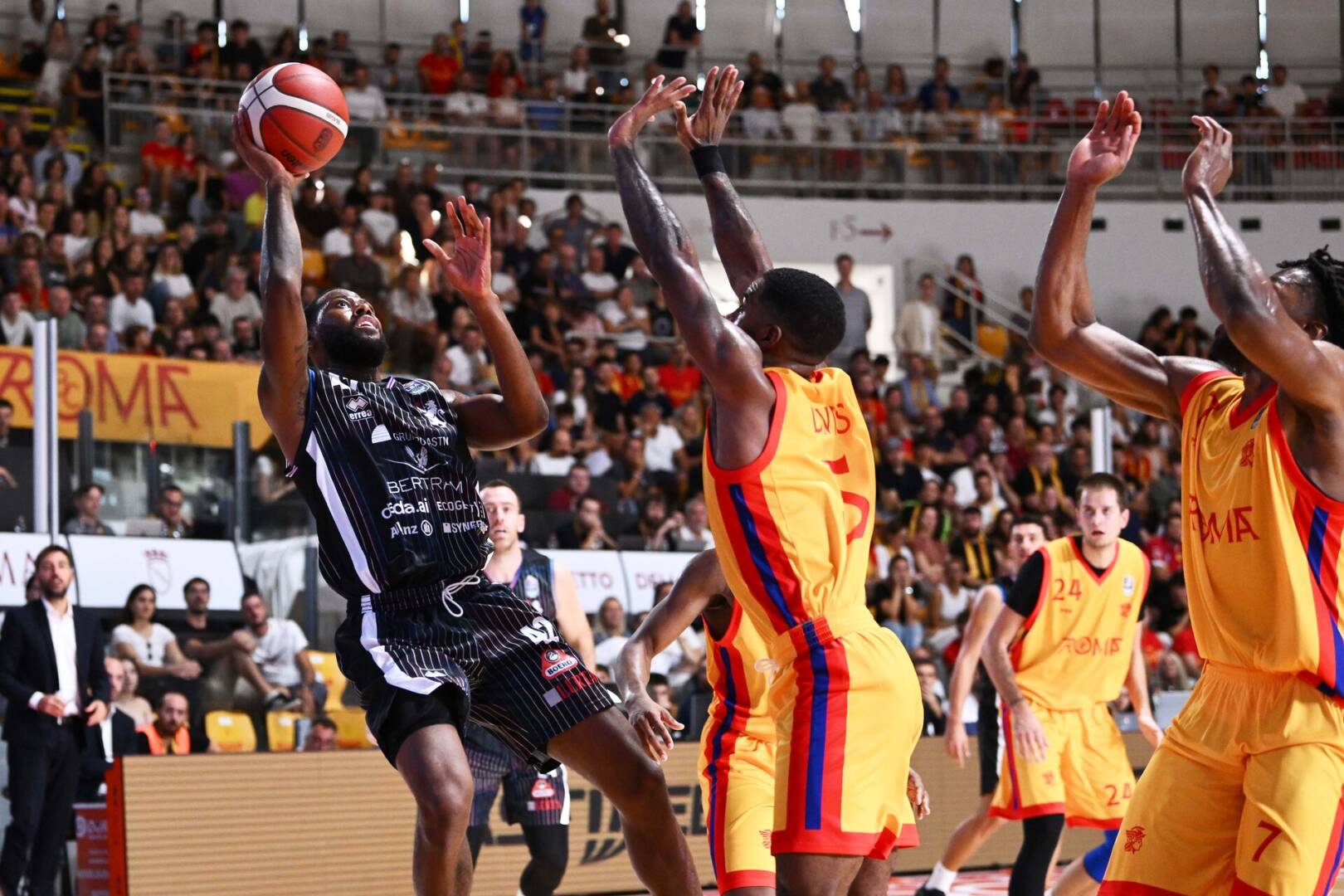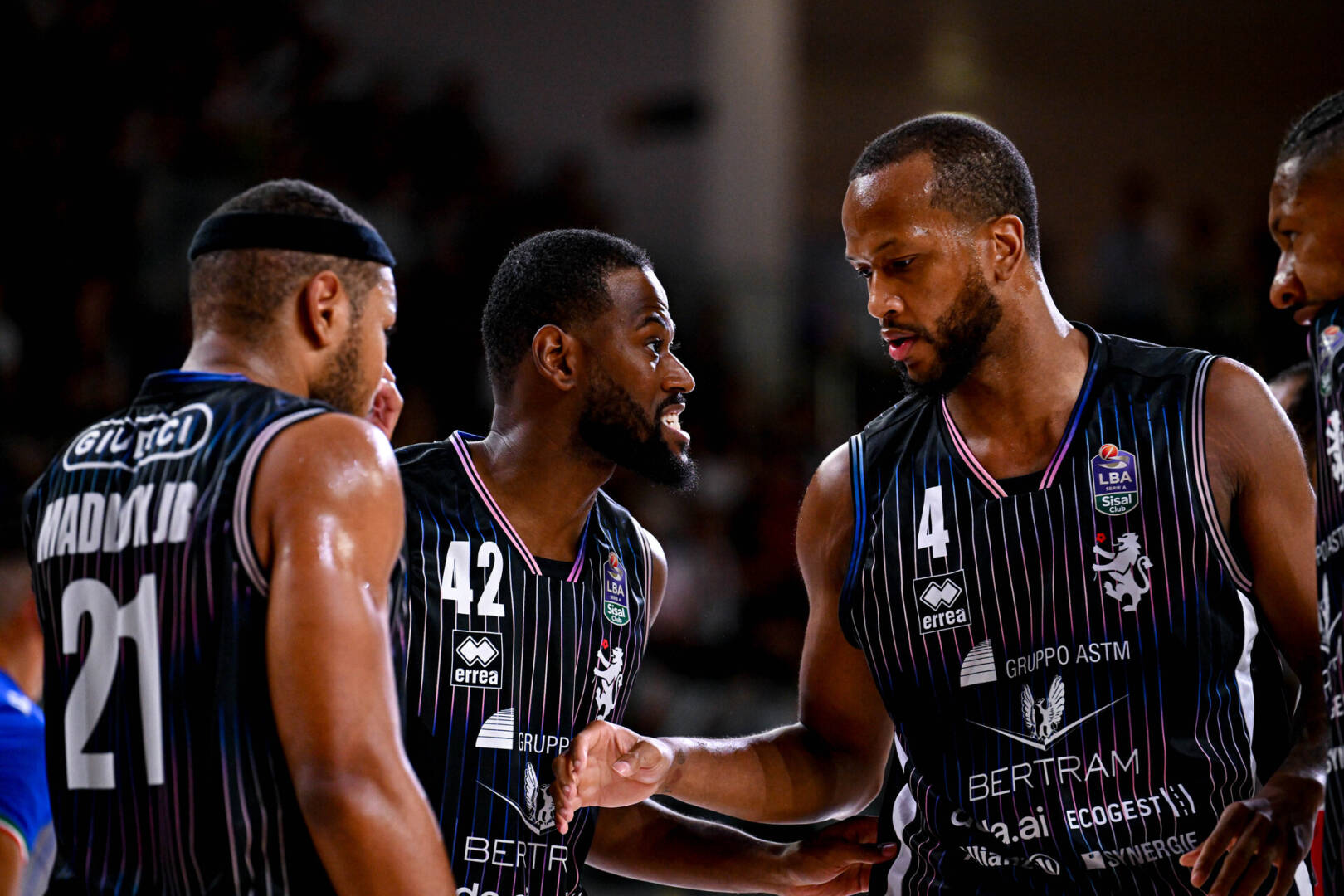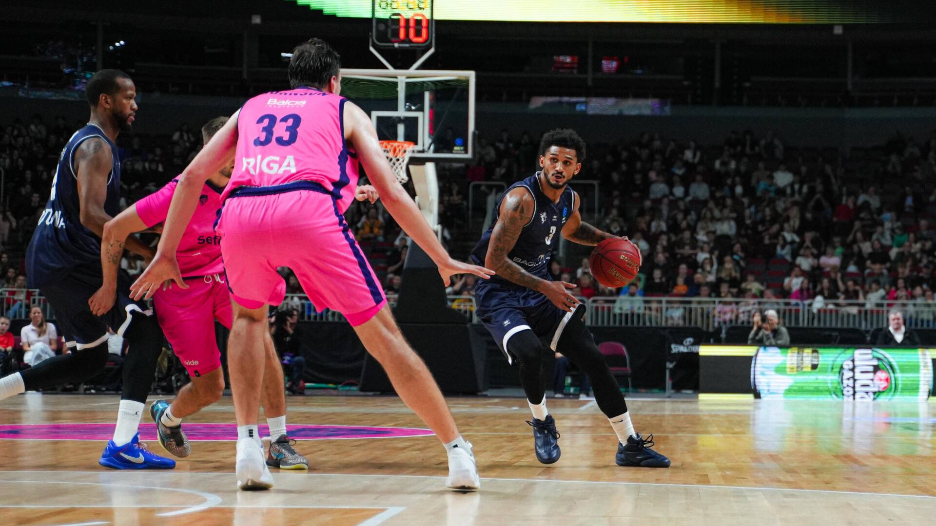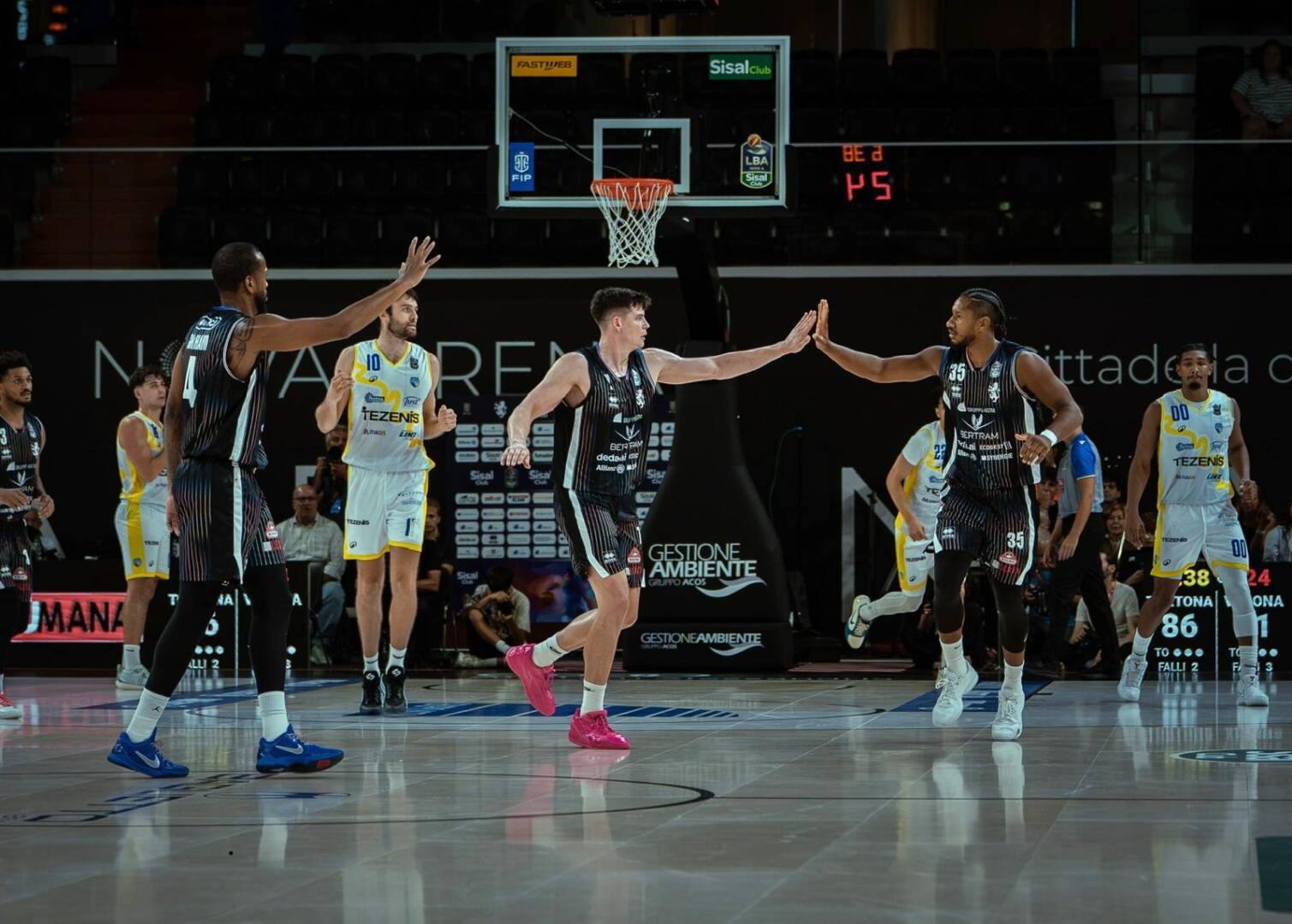



Here's Derthona Basket's new brand identity! "Rooted in history. Ready for the future."
Derthona Basket presents the Club's new brand identity: a contemporary visual system built on the history of the city of Tortona, its symbols, and the ambition to consolidate its position in European basketball.
"Rooted in history. Ready for the future ." This is the principle on which the entire brand identity is built. Not just a simple "logo change," but the rediscovery of a unique, recognizable, and flexible identity system, designed to accompany the club's future on and off the field.
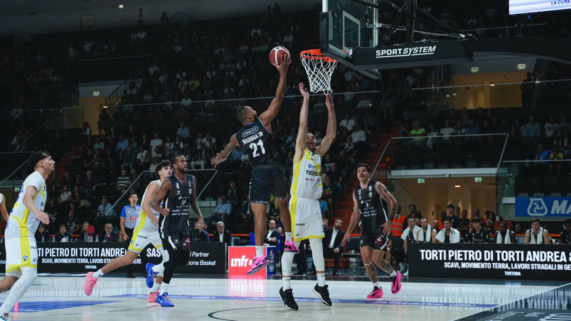
The project stems from the desire to strengthen the bond between the Club, the city, and the community, translating this relationship into a language capable of living with the same coherence on the team, in the spaces of the Cittadella dello Sport, in the media, on digital platforms, in merchandising, and at every point of contact with fans, partners, and the local area.
History isn't treated as something to be preserved behind a glass case, but as a foundation upon which to continue building. A heritage that spans generations, evolves over time, and today finds a new form of expression.
Derthona Basket President Marco Picchi: "The new brand identity was born from the need to more fully represent what Derthona Basket has become and the direction in which it intends to continue growing. We started from our history and the symbols of Tortona, not to look back, but to build an identity capable of accompanying the club's future. A system that can belong to the team, the city, and the entire Derthona community, maintaining the same strength and recognizability on and off the court."
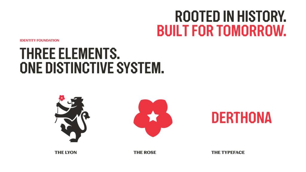
THREE ELEMENTS. ONE RECOGNIZABLE SYSTEM.
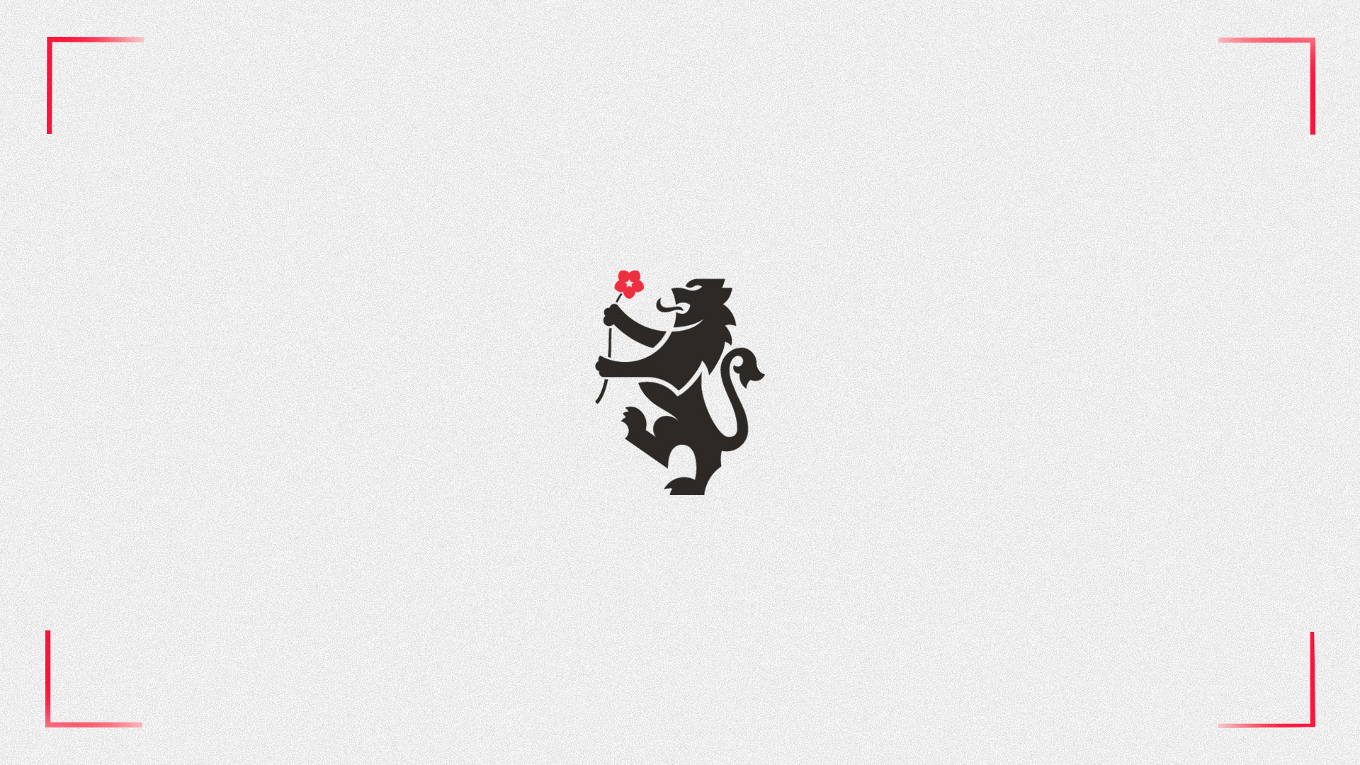
The new identity system is built around three fundamental elements: the Lion, the Rose and Derthona Display, the Club's new original typography.
THE LION A historic symbol of the city, the lion represents courage, generosity, and grace. It ties basketball to the local area and returns to be the central element of the Club's identity.
THE ROSE, a symbol of Tortona's civic tradition, completes the story of its identity. Much more than a decorative element, it is a symbol that the Club carries with it and projects into the future.
DERTHONA DISPLAY Designed starting from the visual heritage of Tortona, its architecture and its hills, and reinterpreted through the language of basketball, it becomes the voice of the Derthona identity.
ONE IDENTITY. MANY CONFIGURATIONS.
The Lion, the Rose and Derthona Display make up an open and flexible system.
The different configurations of the logo, monograms and individual elements of the identity have been designed to adapt to different contexts, formats and sizes, always maintaining consistency and recognisability.
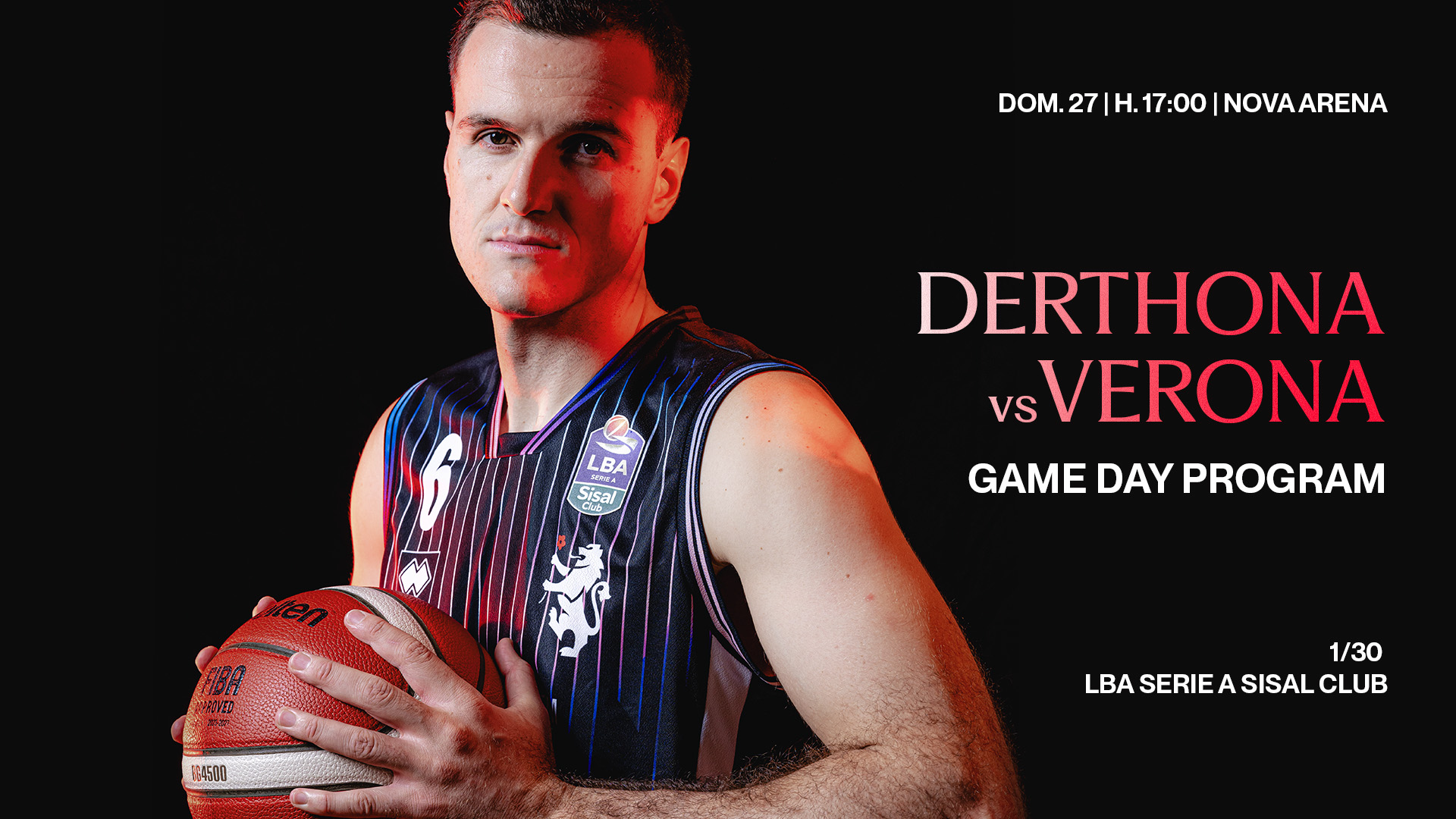
From the playing jersey to digital platforms, from the Nova Arena to institutional materials, all the way to the Club's merchandising and daily communications: the same identity can take on different forms without losing its character.
THREE COLORS. ONE UNMISTAKABLE IDENTITY.
The palette features three colors. Tortona Red brings the city's historical heritage into the system. Derthona Black and Derthona White represent the Club's historical identity and define its visual character.
Three colors that create an essential, clear, and immediately recognizable language, in which nothing is purely decorative and every element has a function.
THE CURVE. GESTURE AND GRAPHICS.
The system is completed by the curves, the graphic gesture in which basketball and territory meet.
"The Curve" recalls the trajectory of a shot, the energy of the Curva, the hills surrounding the city, and the vaulted forms of the Magazzini del Sale in Tortona designed by Pier Luigi Nervi. Different elements, united by the same form.
Through repetition, movement, and variation in scale, these references become a dynamic and recognizable language, capable of crossing campaigns, digital content, institutional materials, merchandising, and physical spaces.
A sign built to move. Created to be recognized.
Click HERE to read the online press release and download all the brand identity assets.
The launch video
DERTHONA BASKETBALL
The Club, supported by the Gavio Group, is a sporting organization deeply rooted in the city of Tortona and its surrounding area. The growth of the sports project, the development of the Cittadella dello Sport, and the creation of the Nova Arena have accompanied the Club's evolution toward an ever-expanding dimension. More than just a basketball team, it is a hub capable of uniting sports, entertainment, business, institutions, and the community. The new brand identity shapes this evolution and establishes the language through which Derthona Basket prepares to communicate its future in Italy and Europe.
CREDITS
Derthona Basket's new brand identity was developed by Andrea Perato.
Derthona Display, the Club's proprietary printing house, was designed by ESC Design Studio.
The Motion – the launch video previewed by Sky Sport – was created by Michele Panzeri, In The Middle.
CONTACTS
Derthona Basket Press Office: ufficiostampa@derthonabasket.it
Derthona Basket Marketing Office: marketing@derthonabasket.it
Derthona Basket Website: www.derthonabasket.it